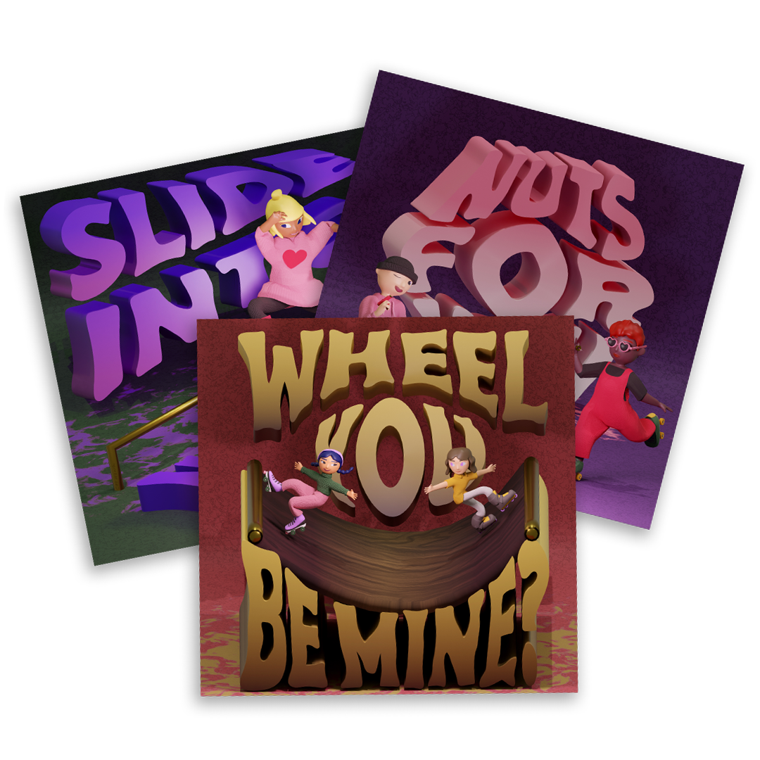
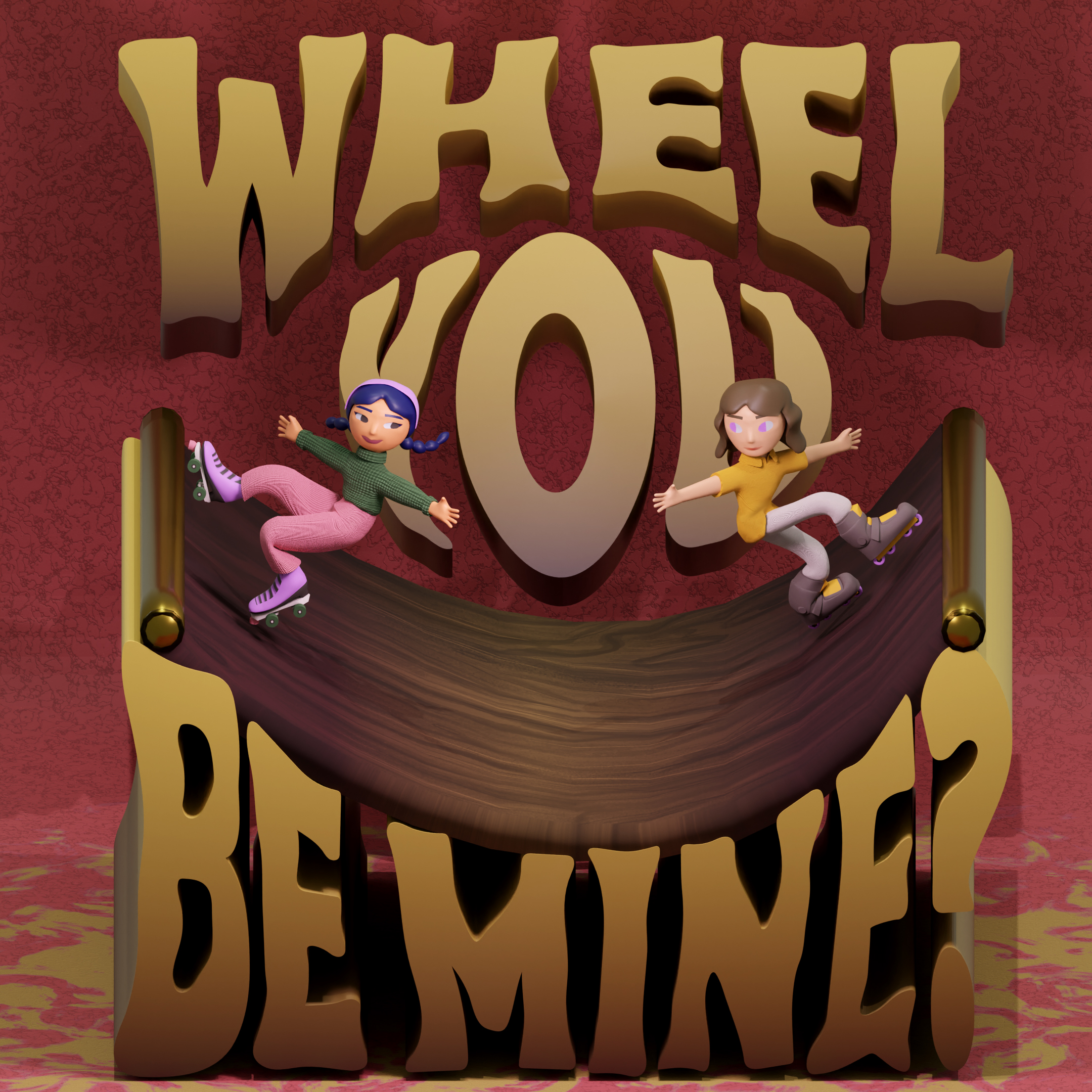
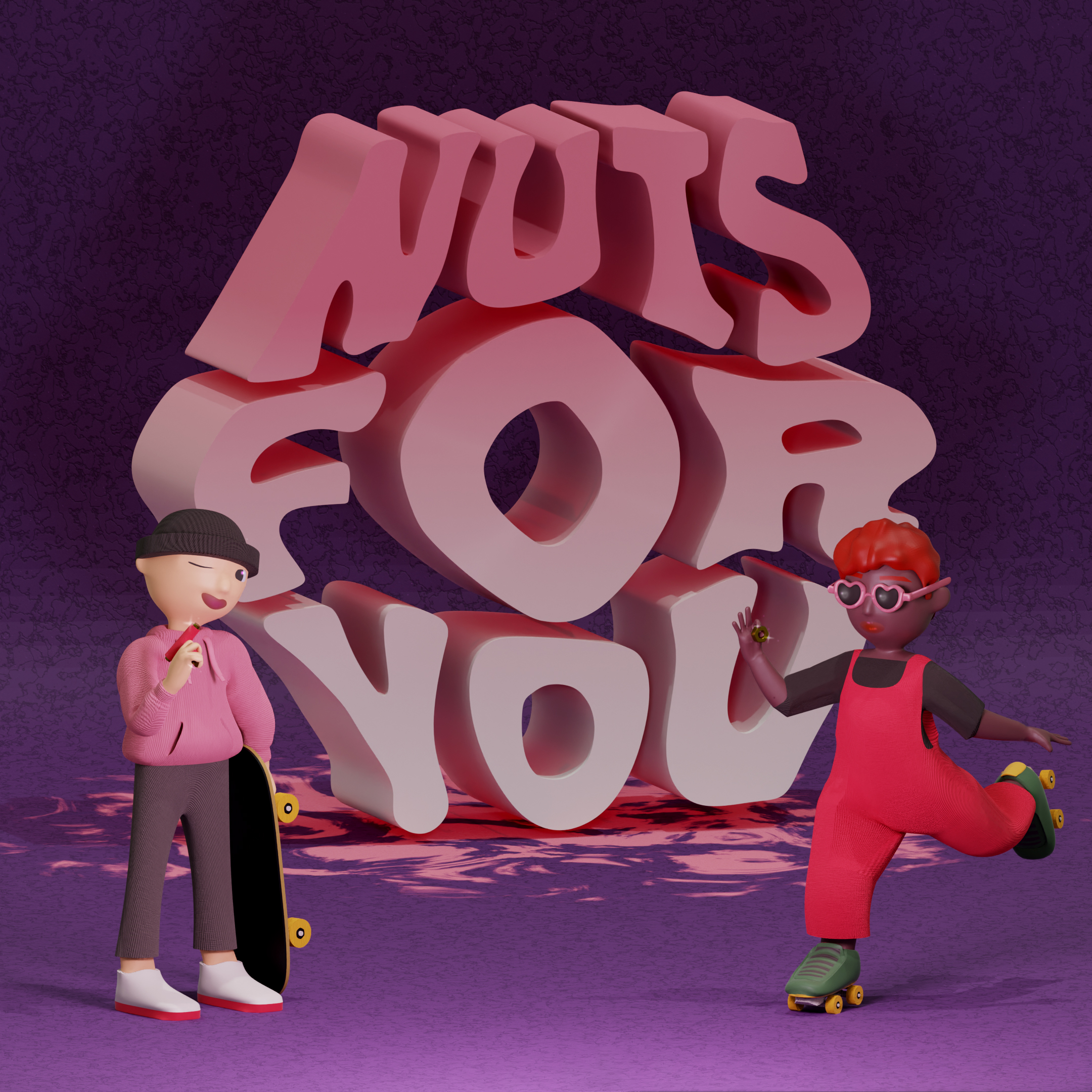
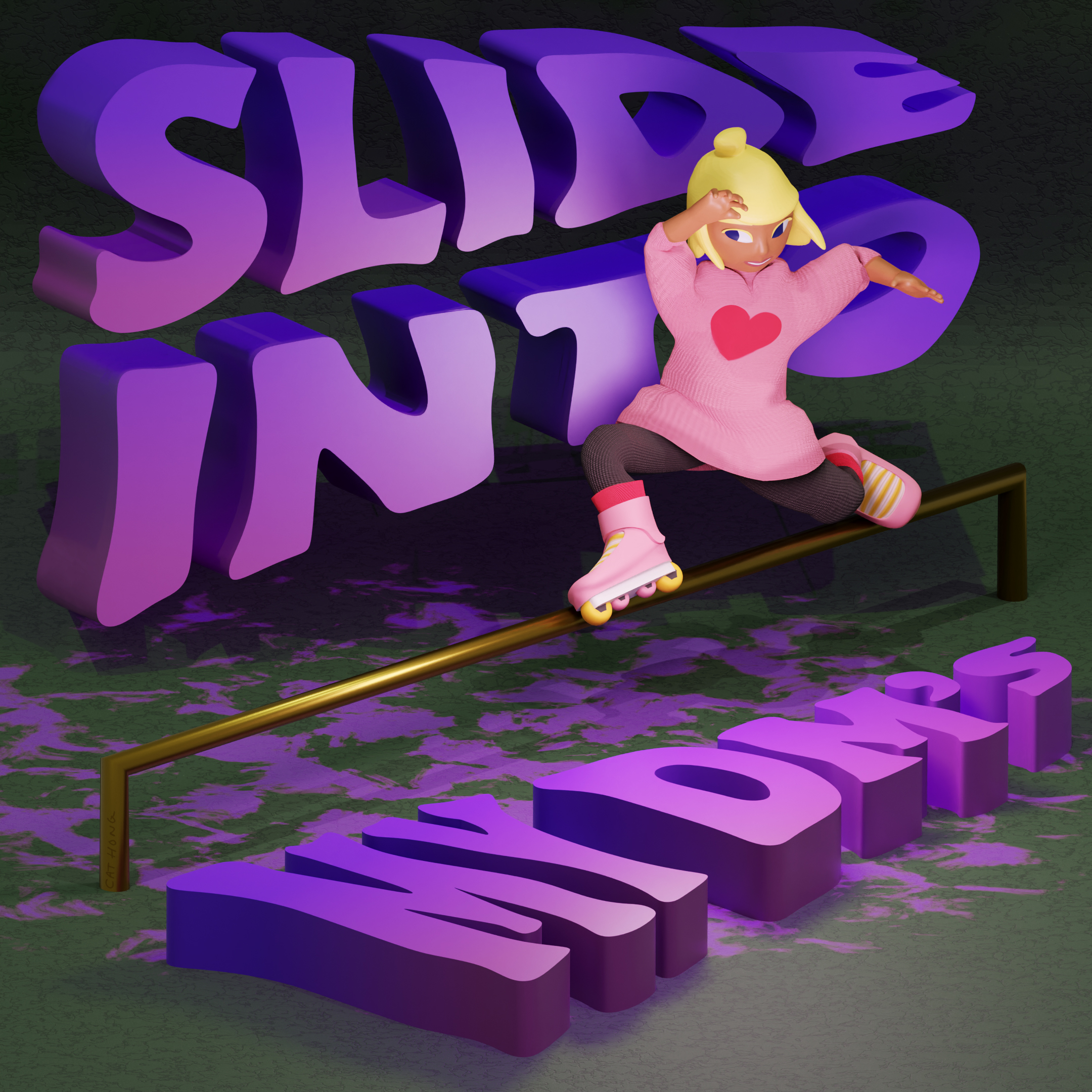
Skate Valentines
A series of skate related puns in the format of Valentines cards.
Visual Development
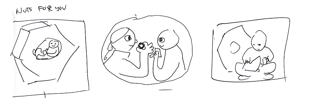
 Composition
A Valentines card is successful based on: how much of the pick-up line makes a statement and illustrative elements. With that in mind, it was critical in my process to divide a majority of the card to the pun. Through iterations, I aimed to use text as grounding architecture.
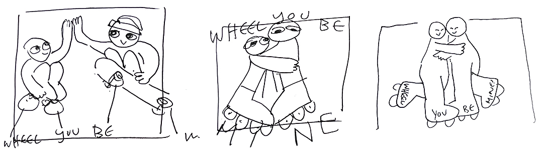
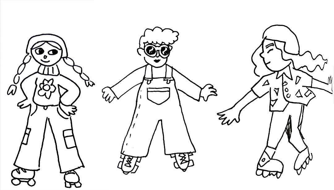 Character Design
I wanted to represent a broad range of: kinds of skating (skateboarding, roller skating, roller blading), identities, and fashion. I used a color palette to unify and act as a design constraint. Colors were determined based on traditional Valentines hues and adjusted based on colors typically found in skate products.
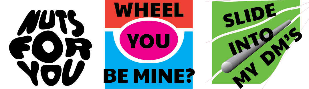 Typography
The typographic elements were inspired by several sources: the trend of wavy type faces (which I'm personally a big fan of), the branding in Blading Cup and Brunny Slide Blocks, and the hand quality in graffiti. I drew the type forms by hand in Illustrator and shaped overall words in unique profiles:
- The shape of a nut
- The shape of a mini ramp
- The dramatic angles of a rail grind